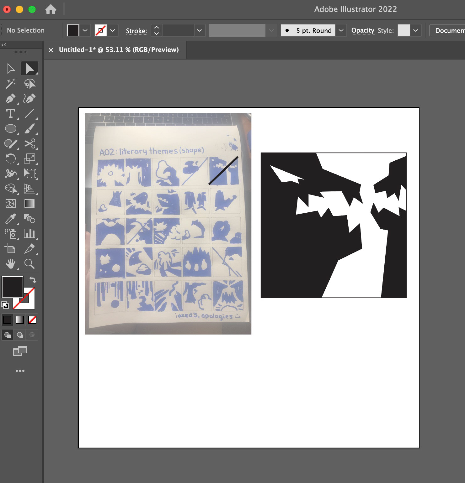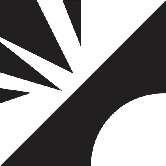
Shape Final
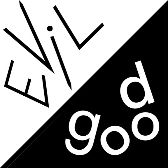
Type Final

Hybrid Final
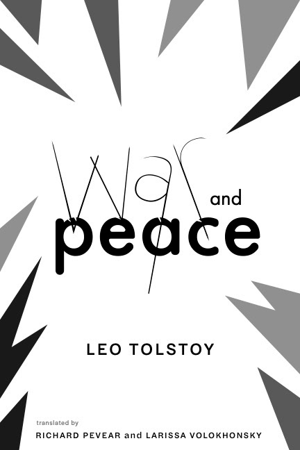
Book Final
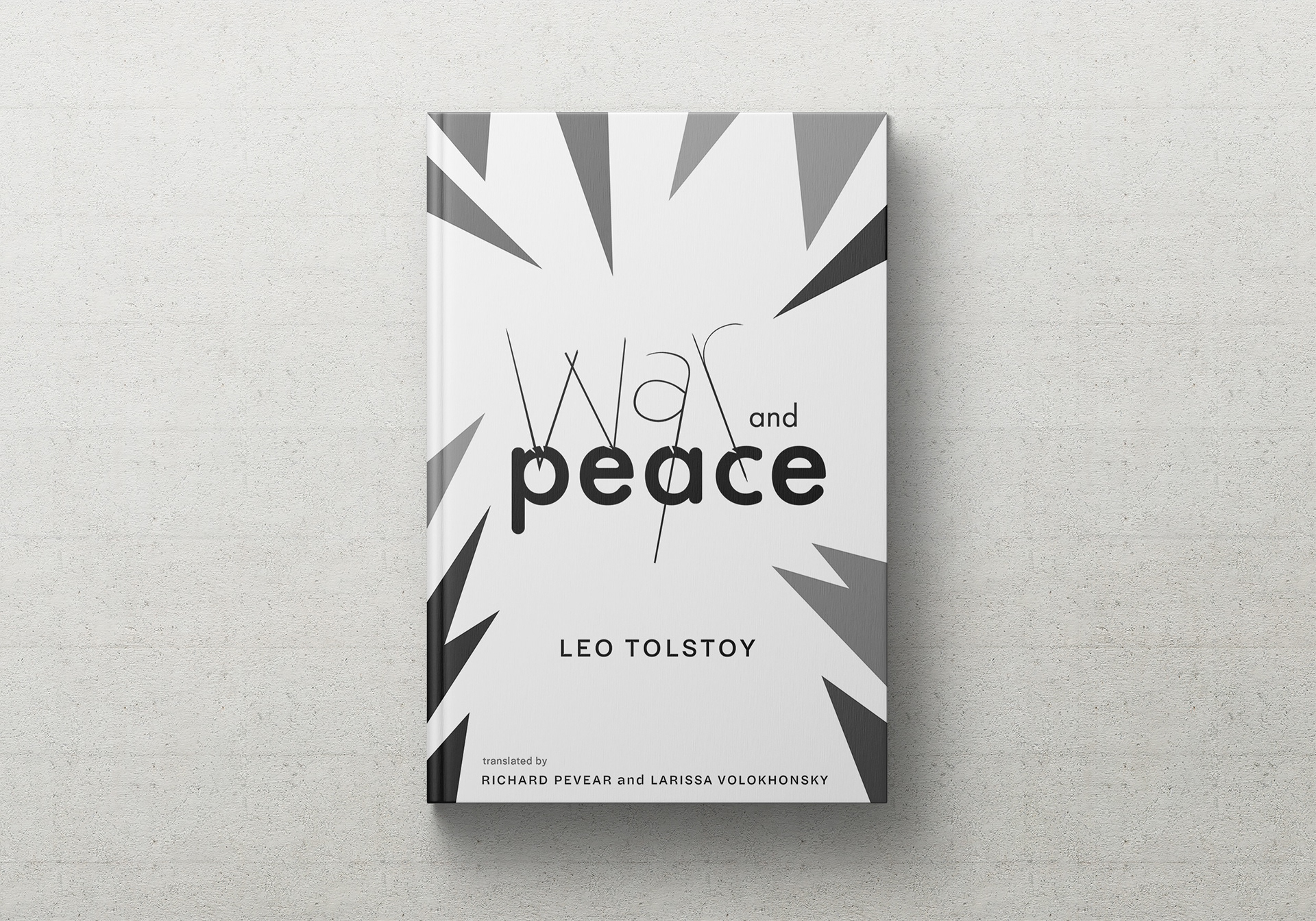
Book Final Mockup
Description
For this project, I focused in on the literary theme of "Good v. Evil." For the first iteration, I really liked the idea of representing "evil" as spikey, geometric forms. Whereas, "good" forms were shown as rounded or more organic-leaning. Overall, most people tend to think of these connotations in this way. When adding type, I tried to mirror these sentiments within the typefaces I used. I opted for a modified Futura and regular Helvetica, placing them so that they take up space as compositional competitors. Taking it into the hybrid phase, I really had fun with it. I imagined a clash between good and evil, the spikey forms within the background denoting movement and shock. The form of "evil" pierces the organic "good" in what looks like a swift pace. I eventually landed on War and Peace by Leo Tolstoy to represent my theme because it bore a lot of similarity to my existing design. I enjoyed this project not just because of the designs, but because I really got a sense of my process. Breaking down the project, week-by-week, helped me see my thought process at each turn.
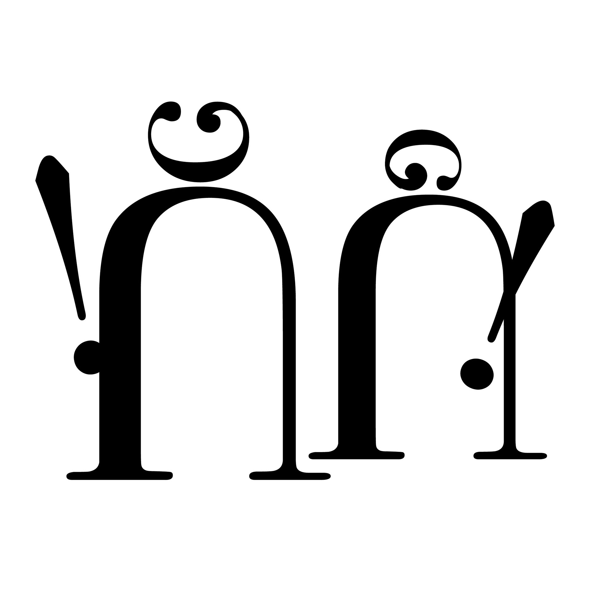
Type Forms Final